
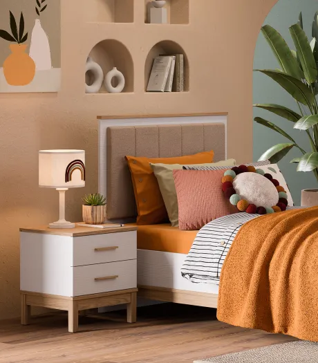
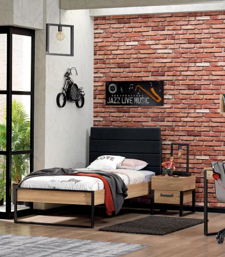
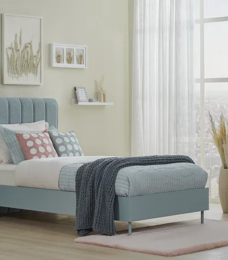
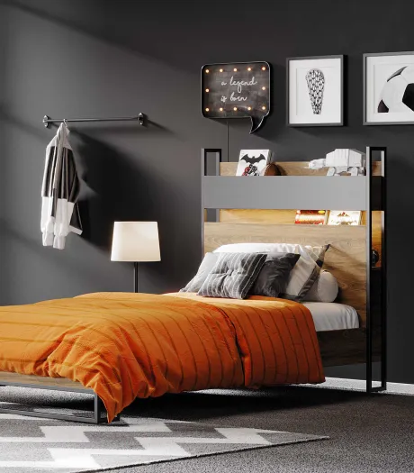
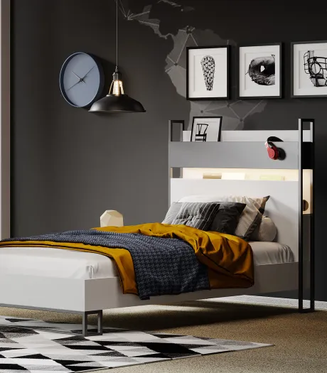
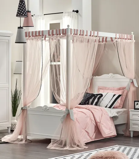
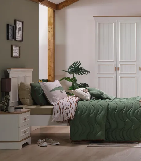
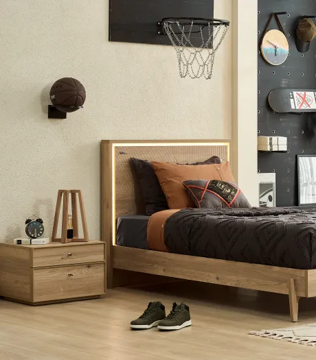
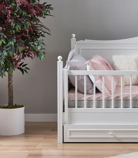
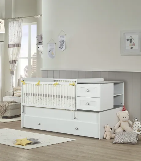
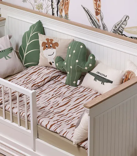
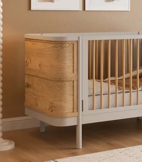
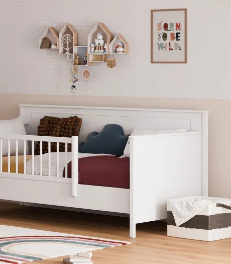
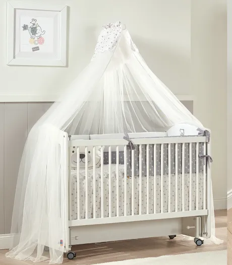
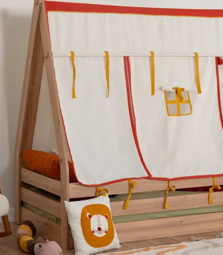
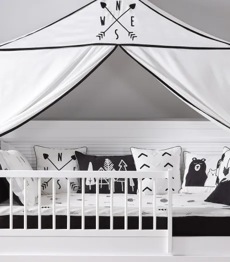
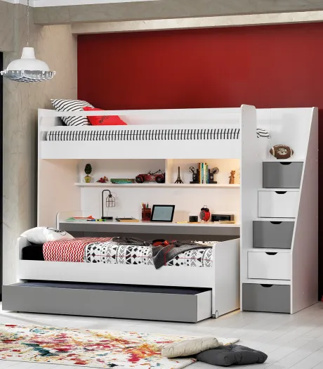
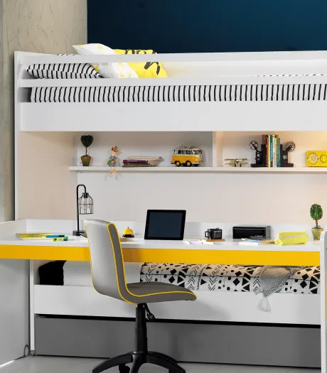
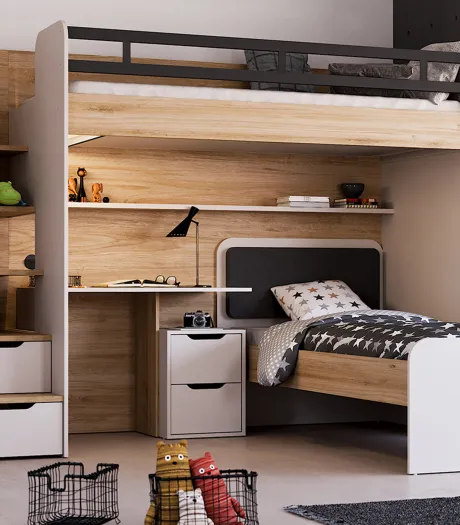
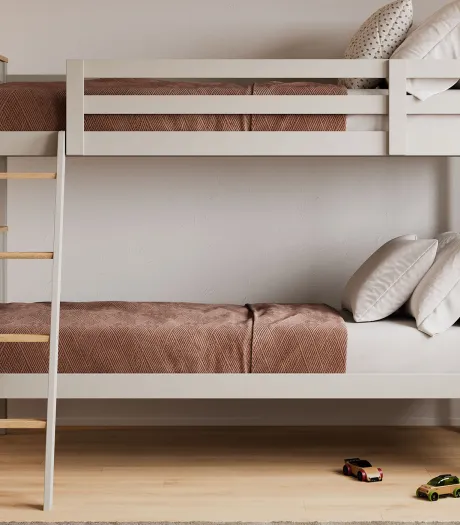
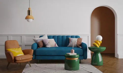
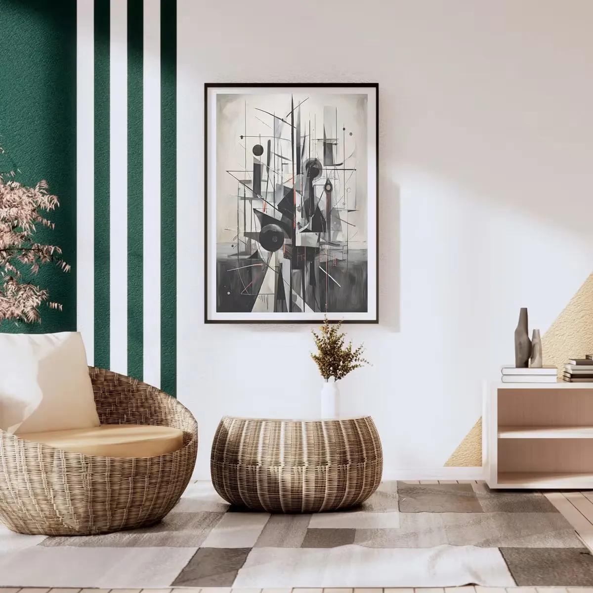
Our visual perception interprets the world not only through shapes but also through the emotional traces these shapes leave in our minds. The spaciousness we feel when entering a space is the result of a balance formed by the reflection of light off objects. Contrast, the most dynamic element of this balance in the design world, is the creation of a visual focal point by clearly differentiating two or more elements from each other. In the modern home designs of 2026, we see that it is no longer just traditional harmony that takes the lead, but bold living spaces with a distinct identity that derive their character from contradictions. Accordingly, the interaction of opposing colors has become the fundamental strategy that determines that fine line between the boring and the inspiring in decoration.
Technically, high contrast is an absolute opposition obtained by using values located at the most distant points of the color wheel together. Although the union of black and white is the purest example of this, the use of contrast in design is not just about "being different" but about managing this difference as a balancing element. This technique, which instantly identifies the focal point, strengthens the perception of depth by ensuring the eye moves along a specific route within the space. Especially in teenager and kids' rooms, where it is necessary to boost energy and trigger creativity, these contrasts are an indispensable design tool.
The Harmony of Opposites in the Color Wheel
The easiest way to double the energy of a color is to place its contrasting color next to it to balance it. However, in design, this contrast actually turns into the greatest friendship. The color wheel, developed since Newton, gives us the answer to the question of what opposite colors are with scientific certainty. Colors standing directly opposite each other on the wheel elevate each other's saturation to the highest level.
To make the right matches in your spaces, taking a look at the list of basic opposite colors will accelerate your design process:
Primary Color | Complementary (Opposite) Color | Effect |
Blue | Orange | Dynamic and Modern |
Red | Green | Natural and Energetic |
Yellow | Purple | Luxurious and Artistic |
You don't always have to use these pairings in a 50-50 ratio. Often, using one color as dominant and its opposite in accessories or details allows you to achieve a more professional color contrast.
What are the Popular Color Pairings and Application Areas?
In decoration, the language of colors is reshaped according to the function of each room. For example, while focus is required in a workspace, vibrancy is desired in a play area. The details of the most preferred contrast combinations are as follows;
The Natural Balance of Red and Green
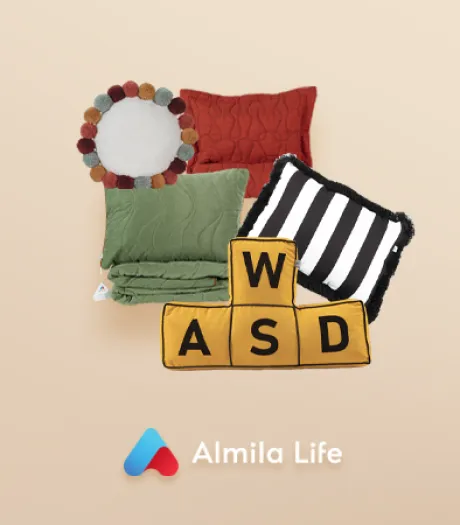
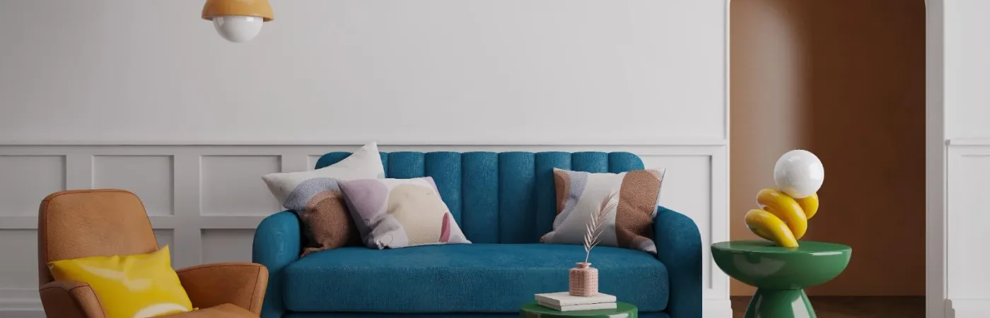
This duo, which we encounter most frequently in nature, is quite risky in interior spaces but equally impressive. Green, which is the opposite color of red, calms red's aggressive and stimulating effect. If you are going to use these tones, which are the contrasting colors of red in a room, you can incorporate red through textiles (pillows, blankets) and green through walls or plants. Similarly, using red—the opposite color of green—as a single wing chair in front of a matte green wall instantly changes the entire atmosphere of the room. A wide scale from burgundy to coral tones can be used as the contrasting color of green.
The Modern Energy of Blue and Orange
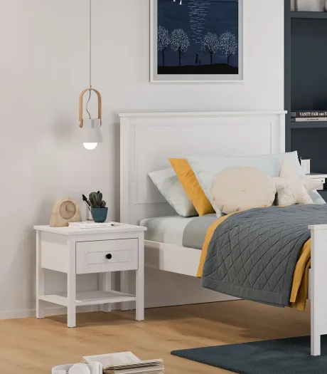
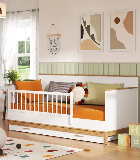
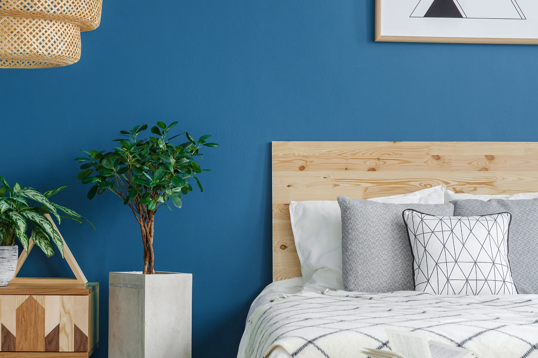
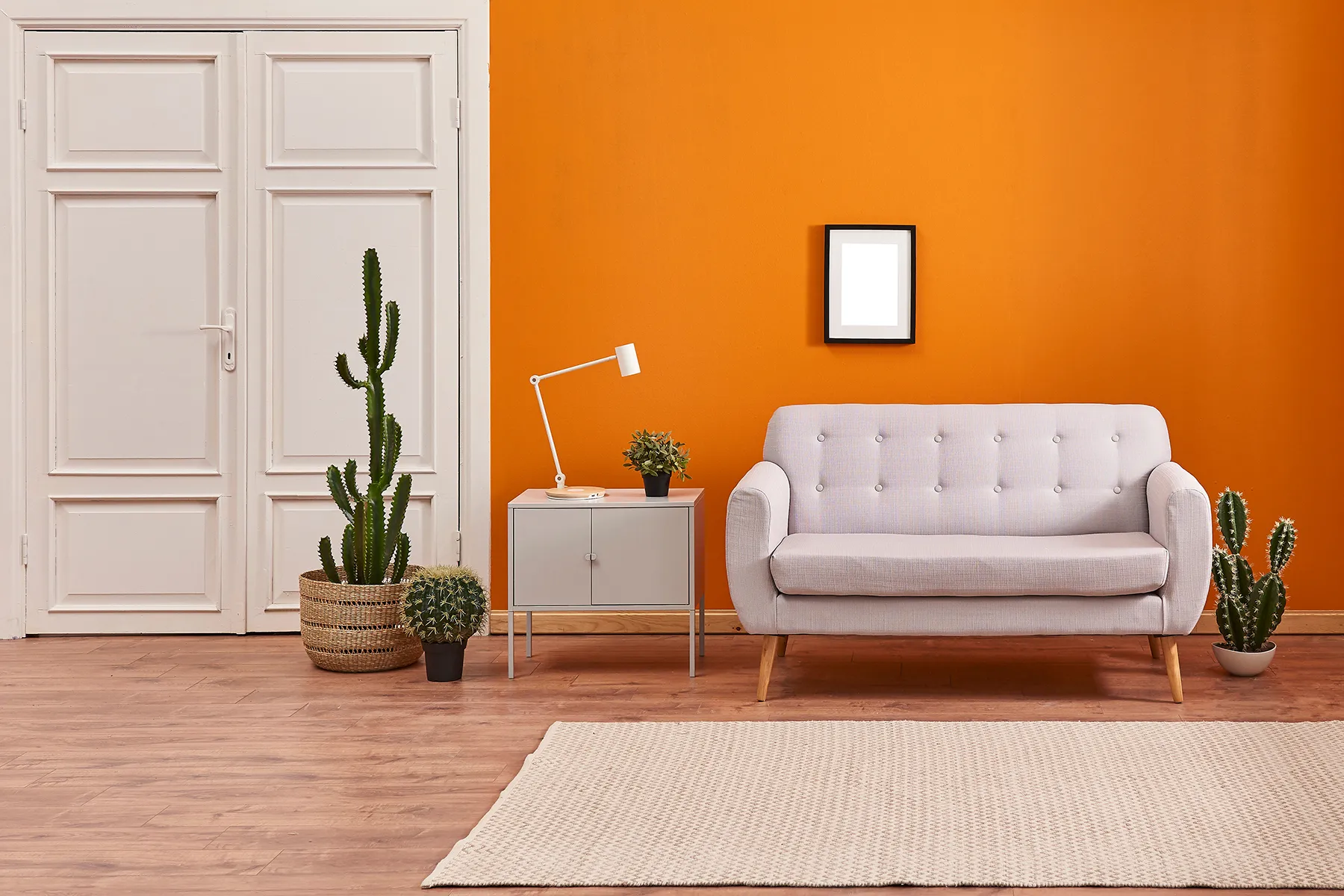
Blue represents peace and the sky; however, when used alone, it can make a room feel "cold." At this point, blue, which is the opposite color of orange, comes into play. The fiery warmth of orange balances the coolness of blue. If you are working with a marine theme in a child's room, adding orange details (drawer handles, bookshelf shelves) as a blue contrast color yields wonderful results.
The Artistic Meeting of Yellow with Purple
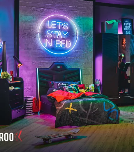
Yellow symbolizes joy and sunlight. Purple, the opposite color of yellow, is the color of mystery and nobility. In teenager rooms, this duo creates a very "cool" and stylish look. For those wondering what the opposite color of purple is, the answer is always the bright yellow of the sun. This combination provides both depth and high energy in the space.
Achieving Contrast with Neutral Colors: Gray and Brown
We don't always have to play with vibrant colors. Sometimes a calmer but still striking atmosphere is desired. At this point, the internal contrasts of neutral tones come into play.
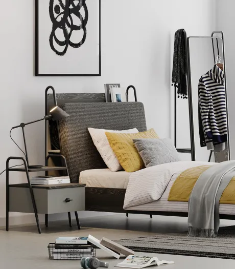
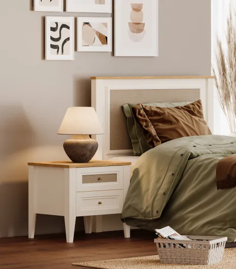
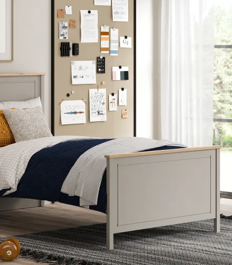
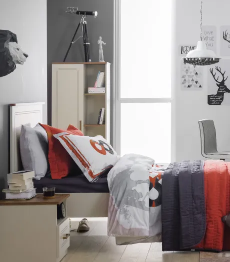
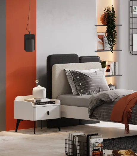
The opposite color of gray is technically not sought on the color wheel; gray is a value. However, in visual perception, the best contrast to gray is the warmth trapped within it. That is, the best partner for a cold gray like anthracite is a vibrant mustard yellow or a warm copper tone. For those who love earth tones, what is the opposite color of brown? Since brown is a dark and muted version of orange, its visual opposites are cold tones leaning towards blue, such as turquoise and cyan. This contrast carries rustic designs into a modern line.
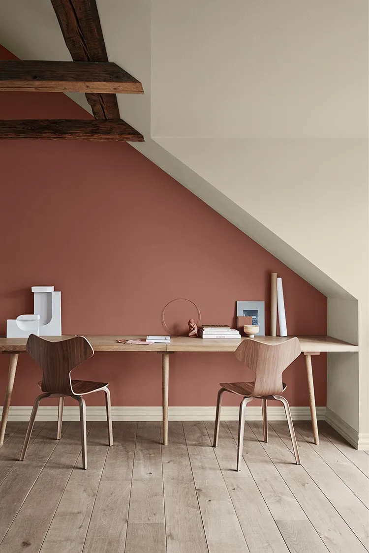
Contrast Application Guide for Teenager and Kids' Rooms
Teenager rooms and kids' rooms are the most "free" areas of the house. Here, it is possible to stretch the rules a bit and perform experimental work with opposite colors. However, a contrast application in these areas should be carried out with a specific system so as not to affect the child's sleep and study efficiency.
For application, you can follow these steps;
Choose a primary color that will make up 60% of the room. This is usually the walls or large furniture.
Find the tone opposite the color you chose. For example, if you chose a blue room, make room for orange in the details.
Soften this contrast with neutral colors such as black, white, or gray. This prevents eye fatigue.
Don't settle for just colors. Create a multi-dimensional feel by adding a matte carpet next to a shiny desk or a coarse-textured wool blanket over a metal bed frame.
Light changes the saturation of colors. Yellow light makes warm tones (orange, red) even more prominent, while white light highlights cold tones (blue, green).
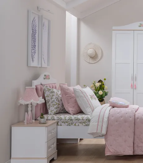
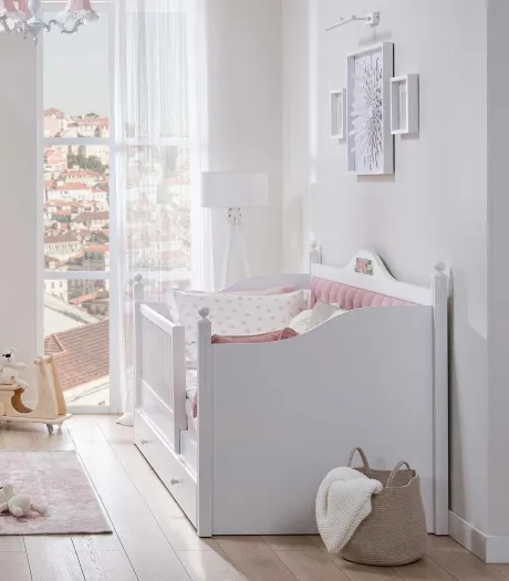
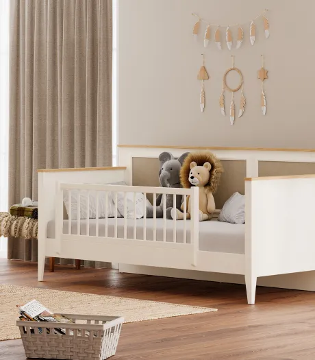
When designing a child's room, it is important to adjust the dose of contrast according to age. While more pastel contrasts (such as soft pink - soft green) are preferred in baby rooms, combinations that answer the question of what is sharp and high contrast (such as black - neon yellow) for teenagers can better appeal to their search for identity.
The world of colors is not just about "what goes with what"; colors are energies. A correct color contrast strategy applied in your home will not only paint the walls but also revitalize the soul living within those walls.
You Might Be Interested In→ How to Apply and Remove Wallpaper in Kids' and Teenager Rooms?