Room Guide
What Are Contrasting Colors? Tips for Using Them in Teen and Children’s Rooms
Contrasting colors create bold, eye-catching spaces. With the right color combinations, they bring an energetic yet balanced feel to teen and children's rooms.
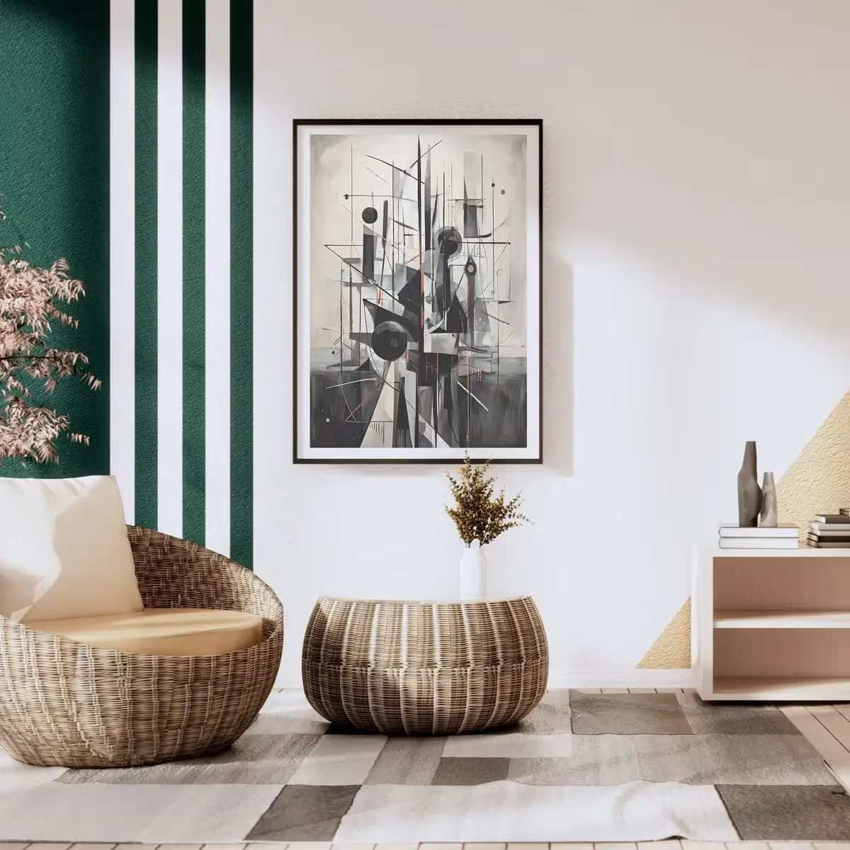
We interpret the world not only through shapes, but also through the emotional impressions they leave in our minds. The sense of spaciousness we feel when entering a room is the result of a balance created by light reflecting off objects. In the world of design, contrast—the most dynamic element of this balance—is the clear distinction between two or more elements, creating a visual focal point. In modern home design for 2026, we’re seeing living spaces that are bold and full of character, drawing their identity from contrasts rather than traditional harmony. In this context, the interplay of contrasting colors has become a key decorating strategy, defining the fine line between dull and inspiring.
Technically, high contrast is an absolute opposition achieved by using colors positioned at the furthest points from one another on the color wheel. While the pairing of black and white is the purest example, using contrast in design isn’t just about “being different”—it’s about managing that difference as an element of balance. This technique immediately establishes a focal point and strengthens the perception of depth by guiding the eye along a specific path through the room. These contrasts are an essential design tool, especially in teen and children’s rooms where energy needs to be boosted and creativity encouraged.
The Harmony of Opposites on the Color Wheel
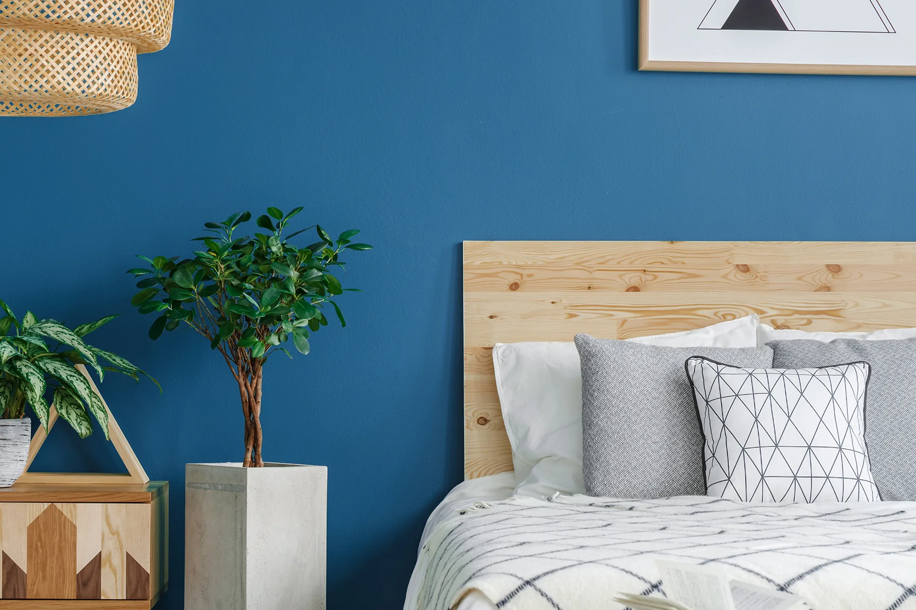
The easiest way to double a color’s energy is to pair it with its opposite, which brings it into balance. In design, however, this contrast can actually become the closest of partnerships. The color wheel, developed since Newton’s time, gives us a scientifically precise answer to the question of which colors are opposites. Colors positioned directly opposite one another on the wheel bring out each other’s saturation to the fullest.
To help you make the right pairings in your rooms, looking through this basic list of contrasting colors can make the design process quicker:
Primary Color | Complementary (Contrasting) Color | Effect |
Blue | Orange | Dynamic and Modern |
Red | Green | Natural and Energetic |
Yellow | Purple | Luxurious and Artistic |
You don’t always have to use these pairings in a 50–50 ratio. Often, using one color as the dominant shade and its opposite in accessories or details creates a more professional color contrast.
What Are Popular Color Pairings and Where Can You Use Them?
The language of color in decorating takes on a new form depending on each room’s function. For example, a workspace calls for focus, while a play area calls for vibrancy. Here’s a closer look at the most popular contrast combinations:
The Natural Balance of Red and Green
This pairing, so common in nature, can feel quite daring indoors—but it’s just as striking. Green, the opposite of red, calms red’s bold, stimulating effect. If you’re using these tones in a room, try adding red—the contrasting color of green—through textiles (cushions, blankets), and bring green into the space on the walls or through plants. Similarly, a single armchair in red, the contrasting color of green, placed in front of a matte green wall can instantly transform the feel of a room. A wide range of shades, from burgundy to coral, can be used as contrasting colors for green.
The Modern Energy of Blue and Orange
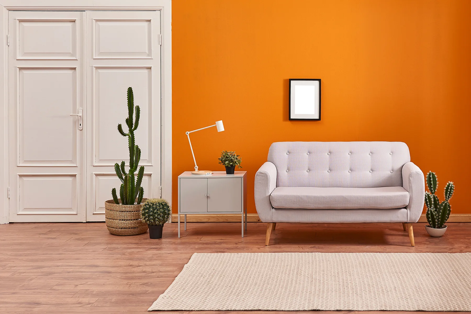
Blue represents tranquility and the sky, but used on its own, it can make a room feel “cold.” That’s where orange comes in. Its fiery warmth balances blue’s coolness. If you’re decorating a children’s room with a nautical theme, adding orange accents as a contrast to blue (drawer pulls, bookshelf shelves) creates a wonderful result.
The Artistic Pairing of Yellow and Purple
Yellow symbolizes joy and sunshine. Purple, the opposite of yellow, is the color of mystery and elegance. In teen rooms, this pairing creates a look that’s both “cool” and full of style. If you’re wondering what the contrasting color of purple is, the answer is always the sun’s bright yellow. This combination adds both depth and energy to a room.
Creating Contrast with Neutral Colors: Gray and Brown
You don’t always have to play with bright colors. Sometimes, you want a calmer atmosphere that still makes an impact. That’s where contrasts within neutral tones come in.
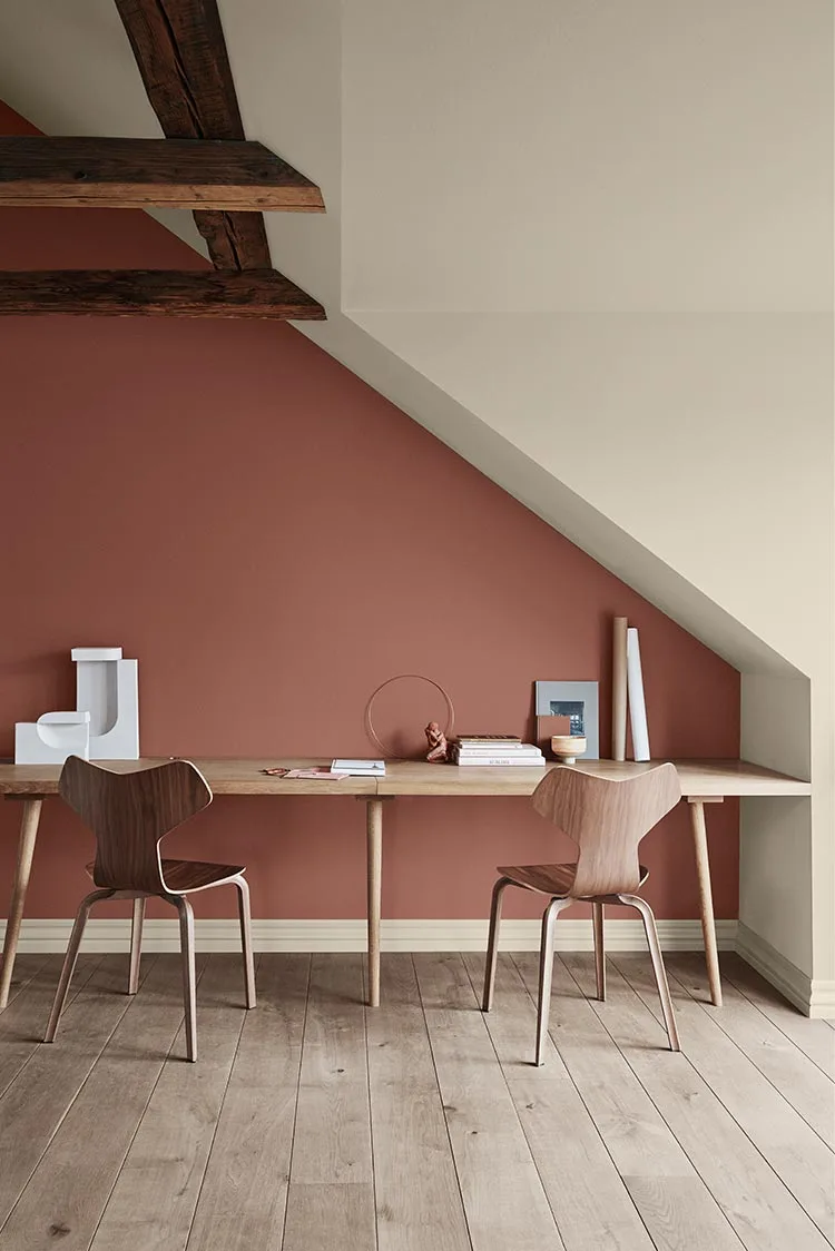
Technically, gray has no contrasting color on the color wheel; gray is a value. But in visual perception, gray’s best contrast comes from the warmth it lacks. In other words, a lively mustard yellow or warm copper tone is the perfect partner for a cool gray such as anthracite. For those who prefer earthy tones, what is the contrasting color of brown? Since brown is a dark, muted version of orange, its visual opposite is cool, blue-leaning tones such as turquoise and cyan. This contrast gives rustic designs a modern edge.
A Guide to Using Contrast in Teen and Children’s Rooms
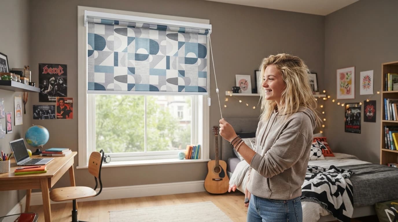
Teen rooms and children’s rooms are the most “free-spirited” areas of the home. They’re the perfect places to bend the rules a little and experiment with contrasting colors. However, contrast should be applied in these rooms with a clear plan, so it doesn’t affect a child’s sleep or ability to study.
For a successful result, follow these steps:
Choose a primary color to cover 60% of the room. This is usually the walls or large pieces of furniture.
Find the shade directly opposite your chosen color. For example, if you’ve chosen a blue room, make room for orange accents.
Soften the contrast with neutral colors such as black, white or gray. This helps prevent eye strain.
Don’t rely on color alone. Create a multidimensional feel by pairing a glossy desk with a matte rug, or adding a coarsely textured wool blanket to a metal bed frame.
Light changes how saturated colors appear. Yellow light makes warm tones (orange, red) stand out even more, while white light brings cool tones (blue, green) to the fore.
When designing a children’s room, it’s important to adjust the level of contrast to the child’s age. Softer pastel contrasts (such as soft pink and soft green) are preferred in nurseries, while sharper, higher-contrast combinations (such as black and neon yellow) may better reflect teenagers’ search for identity.
The world of color is about more than just “what goes with what”—colors are a form of energy. The right color contrast strategy in your home doesn’t just paint the walls; it brings the spirit within them to life, too.
You May Also Like→ How to Apply and Remove Wallpaper in Children’s and Teen Rooms